ShopDreamUp AI ArtDreamUp
Deviation Actions


Suggested Deviants


Suggested Collections


You Might Like…


Featured in Groups

Description
For 
First page: [link]
Next: [link]
---------------------------------------------
*casually throws more wrenches into the plot. Wipes her nose. Keeps throwing more wrenches*
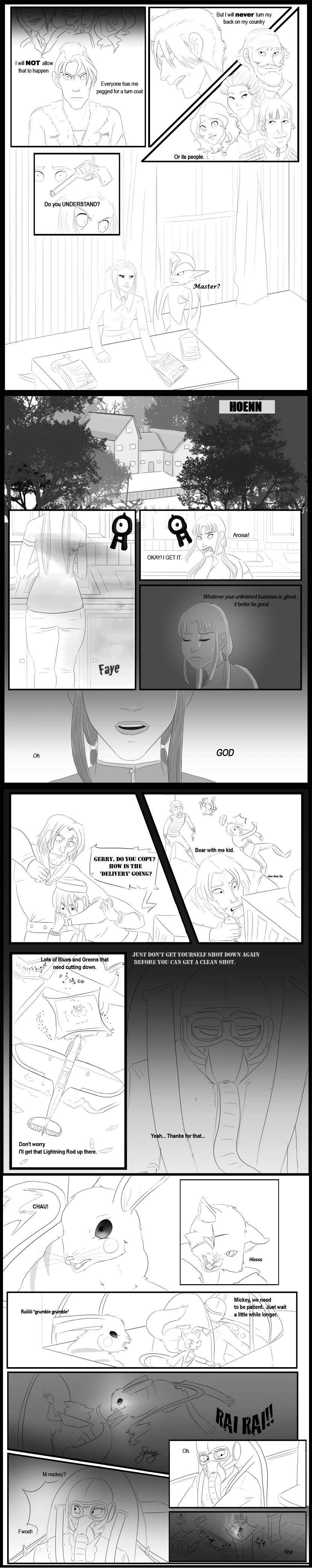
Kat mentioned that staying with Kanto means that he'll be turned into a mindless tool of war. It's something that Elliot fears more than his other fate, which is going completely insane. In addition, due to his dad's vet-status, it's kinda hard to ditch the country your dad nearly died for. He happens to like his country despite not agreeing with it right now, thank you very much.
The papers Kat has are Doctor Richter's psych evaluations, which were conducted post R2. My interpretation is that shestole used them to further narrow down potential recruits. While some may think the war is stupid, it's better of have recorded evidence and an in-depth analysis of that as well. That is how she personalized her call per soldier.
--------------------------------
Elliot's R3 challenge
Featuring:
Gerry
Nike
Cameos:
Scarlett
Karl
Billie
Autumn
Faye
Benjamin
Avery
(Stick Figure) Jane
Non App Cameos:
Cecil Dapper
Suzu Dapper
Ms. Bell
Again, as always, painfully new to comics so any and all critiques will be love loved LOVEEED
First page: [link]
Next: [link]
---------------------------------------------
*casually throws more wrenches into the plot. Wipes her nose. Keeps throwing more wrenches*
Kat mentioned that staying with Kanto means that he'll be turned into a mindless tool of war. It's something that Elliot fears more than his other fate, which is going completely insane. In addition, due to his dad's vet-status, it's kinda hard to ditch the country your dad nearly died for. He happens to like his country despite not agreeing with it right now, thank you very much.
The papers Kat has are Doctor Richter's psych evaluations, which were conducted post R2. My interpretation is that she
--------------------------------
Elliot's R3 challenge
Featuring:
Gerry
Nike
Cameos:
Scarlett
Karl
Billie
Autumn
Faye
Benjamin
Avery
(Stick Figure) Jane
Non App Cameos:
Cecil Dapper
Suzu Dapper
Ms. Bell
Again, as always, painfully new to comics so any and all critiques will be love loved LOVEEED
Image size
830x4170px 1.46 MB
© 2012 - 2024 Torinados
Comments2
Join the community to add your comment. Already a deviant? Log In
Once again your layout is done very nicely, it's easy to follow the flow of action and not get lost.
I think what really hurts this is the inconsistency in values.
What I mean is, some panels more shaded than others, if being shaded at all. With little reason as to why it is done that way. If you include any form of values, you have to keep it consistent. If you have only black and white, you need to keep using the black and white in the same way. Because of the gradients, you introduced a middle tone, grey. By having 3 values (white, grey, black) you create an inbalance by all of the white space, and the thin black lines don't help give a balance to the black either. Not only that, but this is page 2. Page 1 had much more values and shading, making this page stand out even more awkwardly as a page in a set.
I also agree with the previous critique about lines. You use a tablet, right? I would try using a more pressure sensitive brush/setting so you get more line variation. Lines are a great tool of expression, it can help to have thinner lines for objects further away and thicker lines for objects closer. Or even just different thicknesses for different parts of the characters.
Anyway I hope that helps, it still came out really nice and I look forward to future pages.